
Client: Redemption Whiskey
Agency: Pereira O’Dell NY
Role: Art Direction + Design
Inspired by the Prohibition Era, Redemption Whiskey is reviving Rye: the once dominant spirit, key to every classic cocktail.
DP Andrew Wheeler and photographer Victoria Wills helped us capture the atmosphere and mood perfectly — Victoria went above and beyond, bringing the concept of revival to life shooting stills in both traditional tintype and a digital, recolored version to create a new visual world to set Redemption apart from competitors and ground them in the storied history of Pre-Prohibition times. Using real bartenders help lend even more authenticity to the campaign, something we all felt necessary to the story.
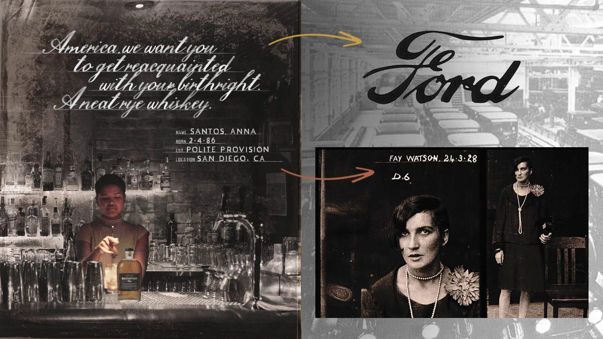
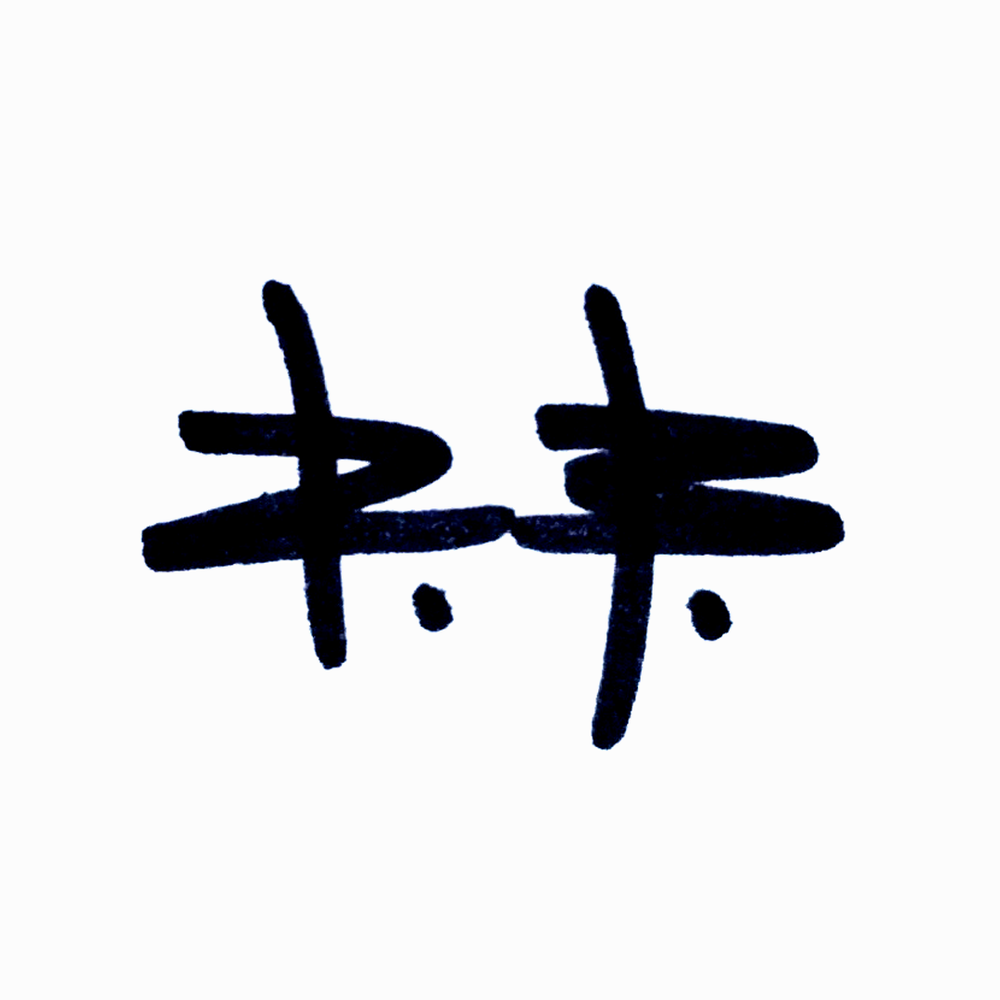
Headlines inspired by old 1920s Ford logo. Subheads inspired by Prohibition mug shots.


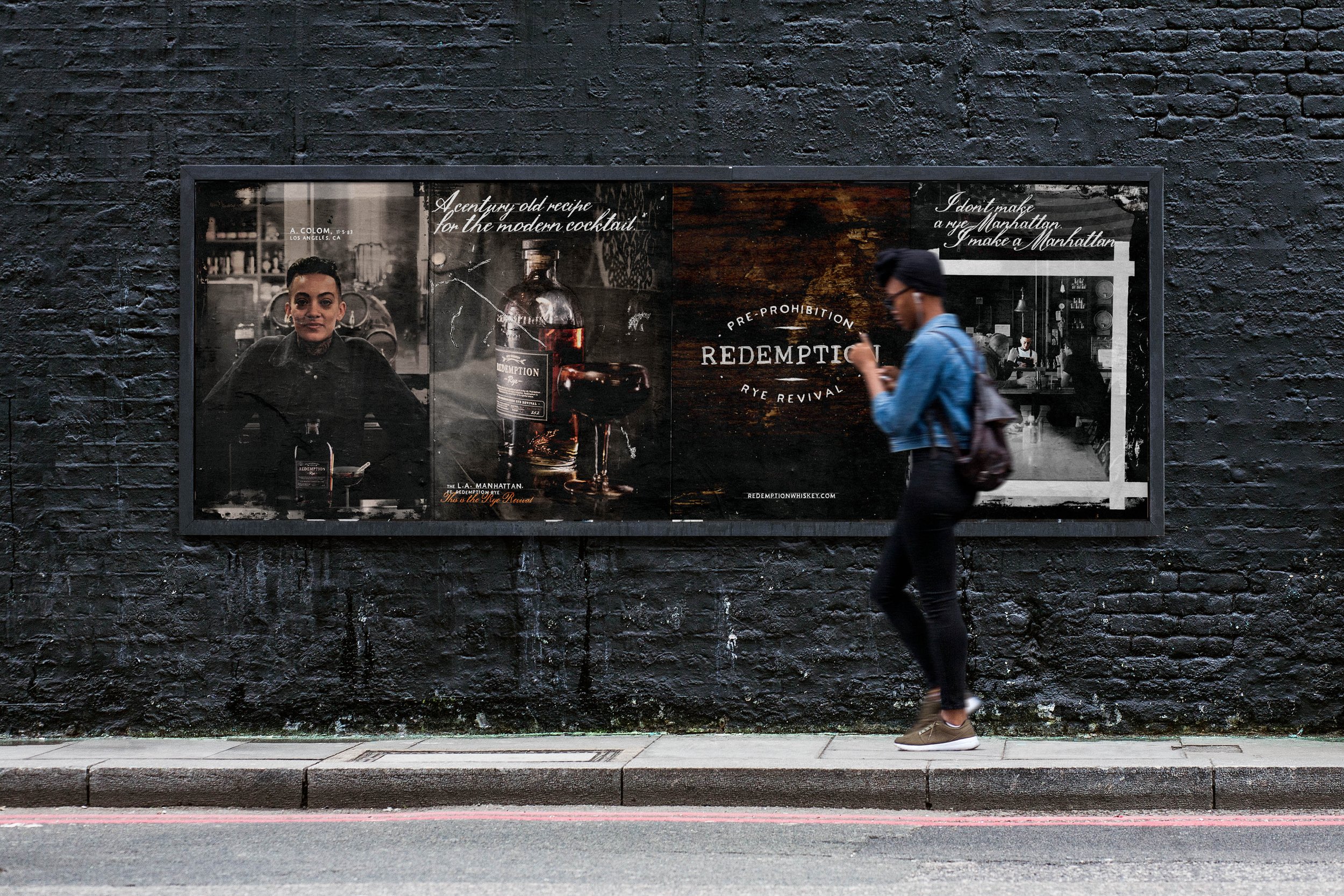
Wild Postings

Still from pitch film. (repurposed from actual mugshot from 1920s)

Still from pitch film. (repurposed from actual mugshot from 1920s)

Still from pitch film. (repurposed from actual mugshot from 1920s)

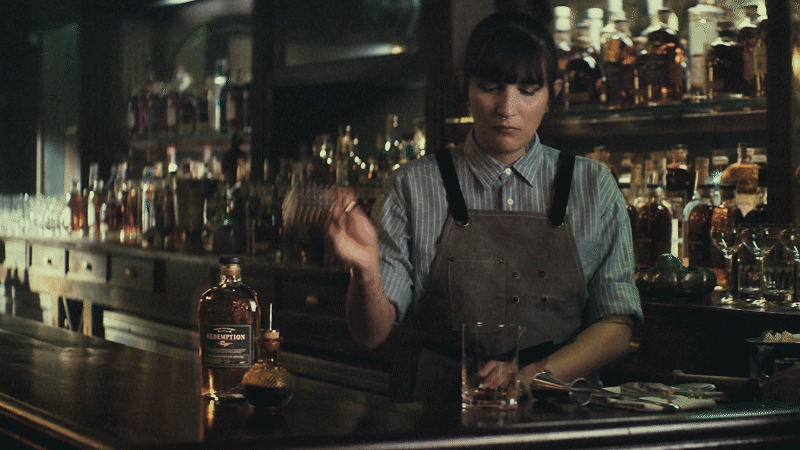
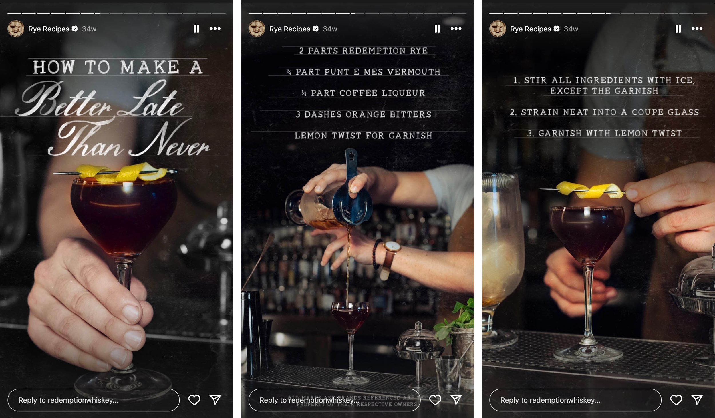
Still from cocktail tutorial video.

Real tintype photographs! and retouched digital photos.
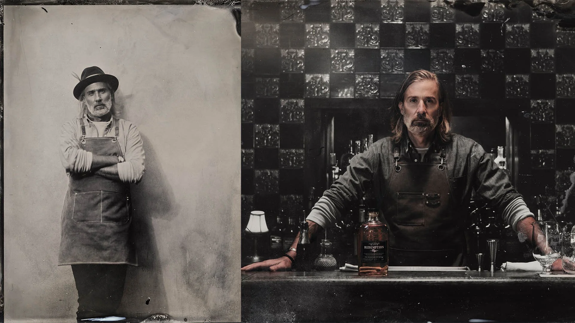
Real tintype photographs! and retouched digital photos.

Real tintype photographs! and retouched digital photos.

Real tintype photographs! and retouched digital photos.

Real tintype photographs! and retouched digital photos.

Client: Hampden-Sydney College
Agency: Familiar Creatures
Role: Creative Direction + Art Direction + Design
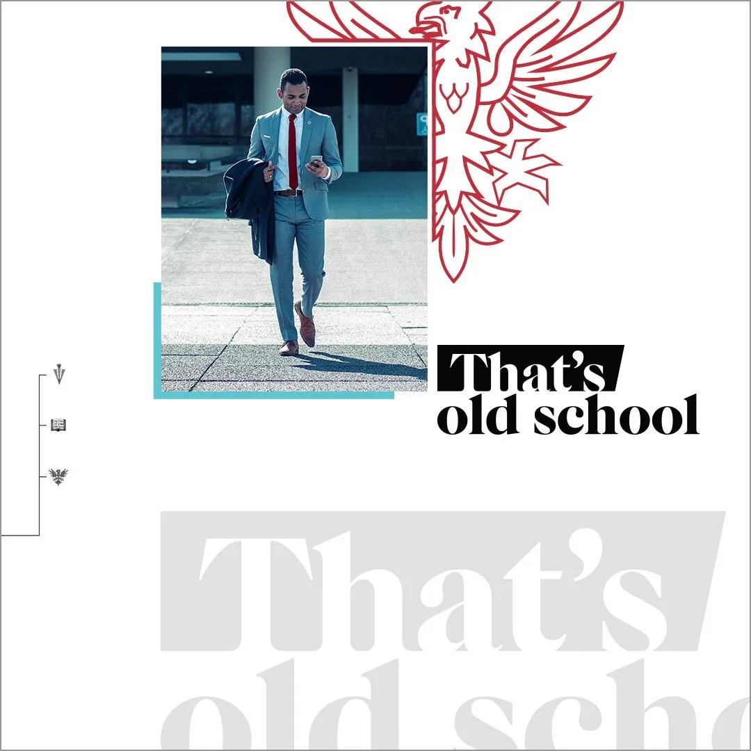
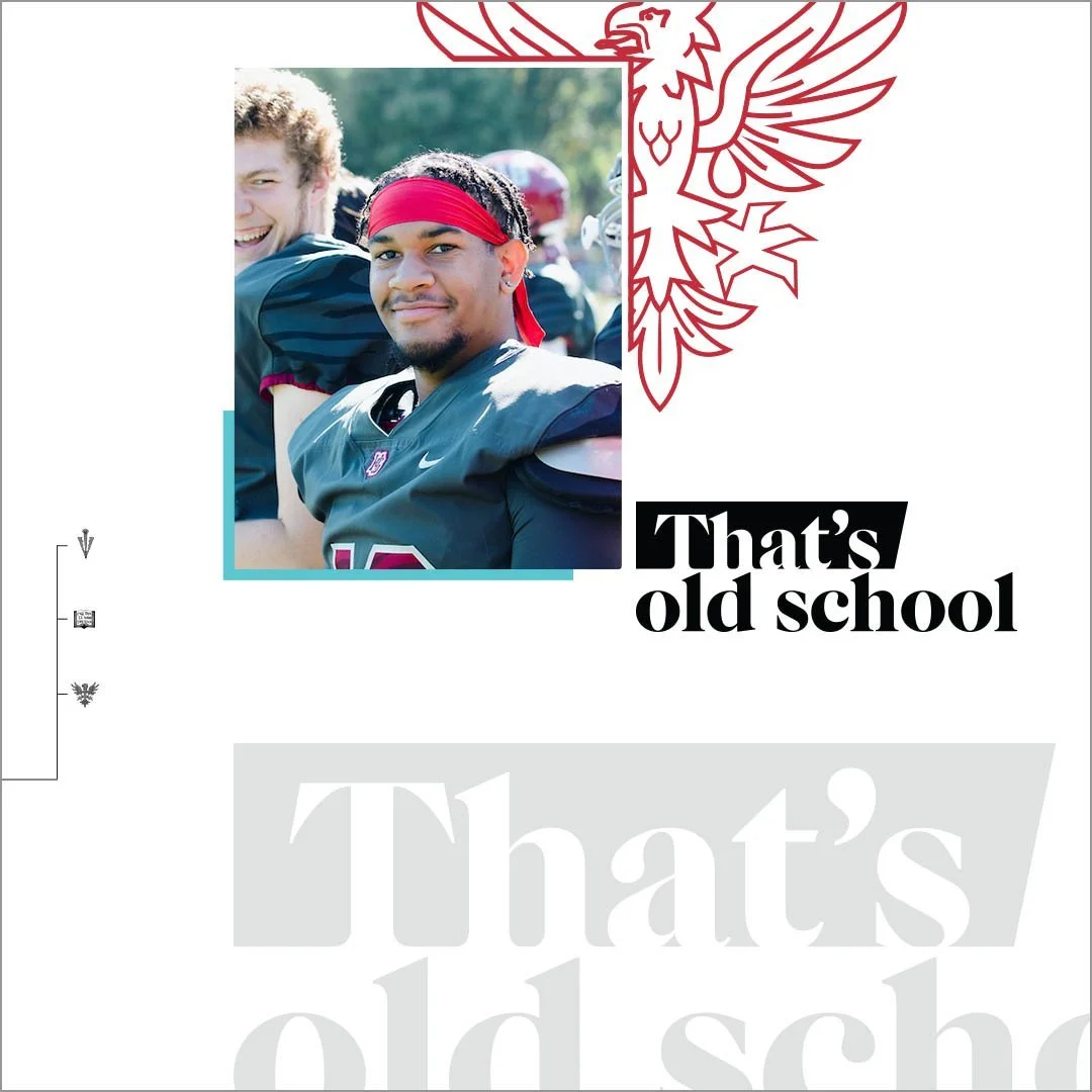
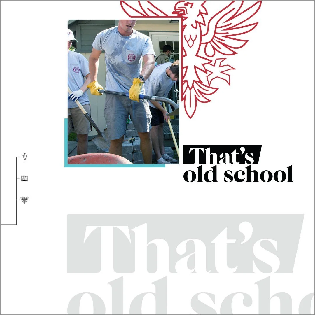
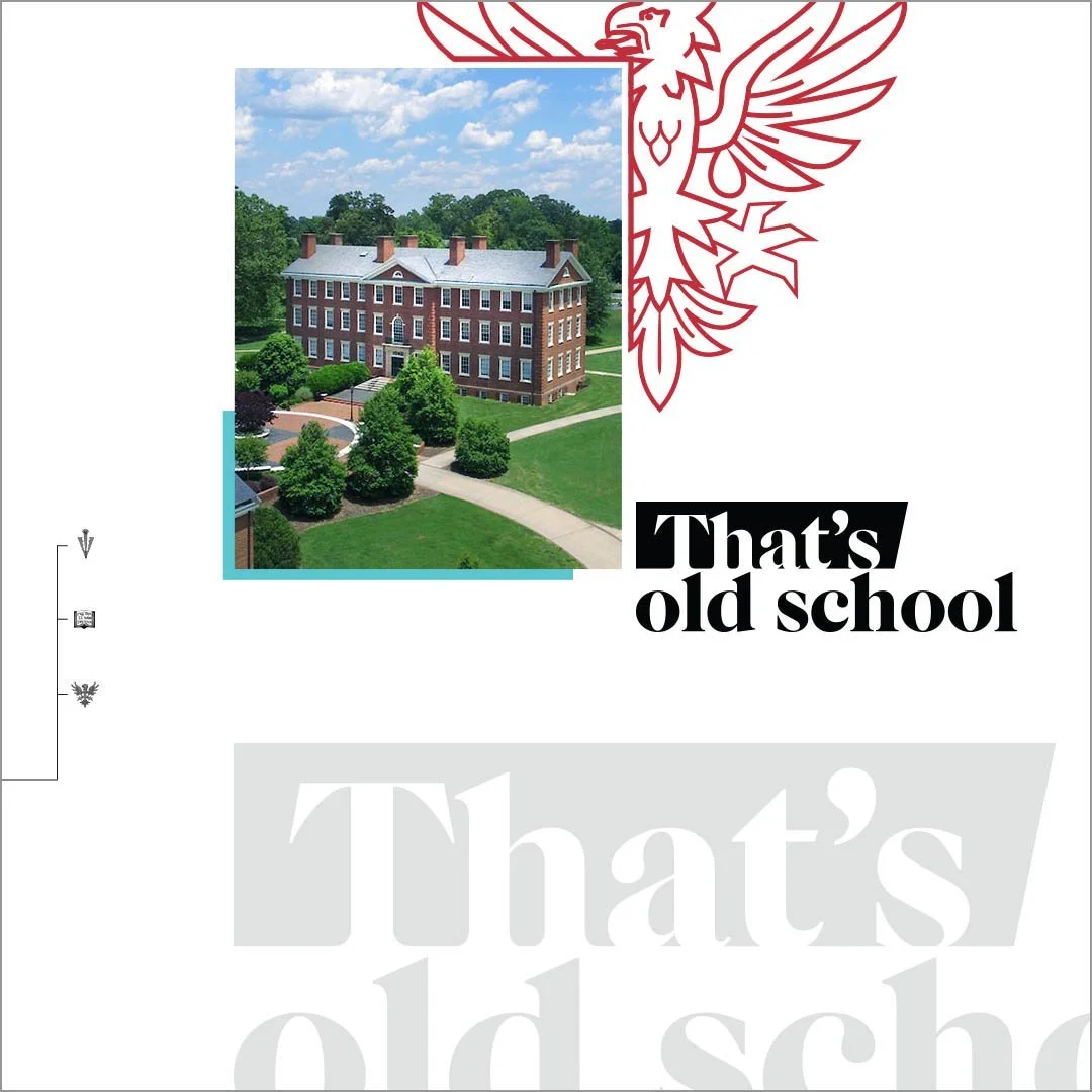
Hampden-Sydney College is a 250-year-old all-male school where old school values help young men become extraordinary leaders.
“Old school” values are not commonplace anymore—they’re quite rare—and especially needed today. Solid rhetoric skills, giving back to the community, being a man of your word, thinking for yourself—These skills give H-SC alums a significant head start towards real-world success.


Headlines use The Brick as a way to define and explain what we mean by “old school.”
Launch Film - YouTube

OOH

Meta Carousel

Digital Banners
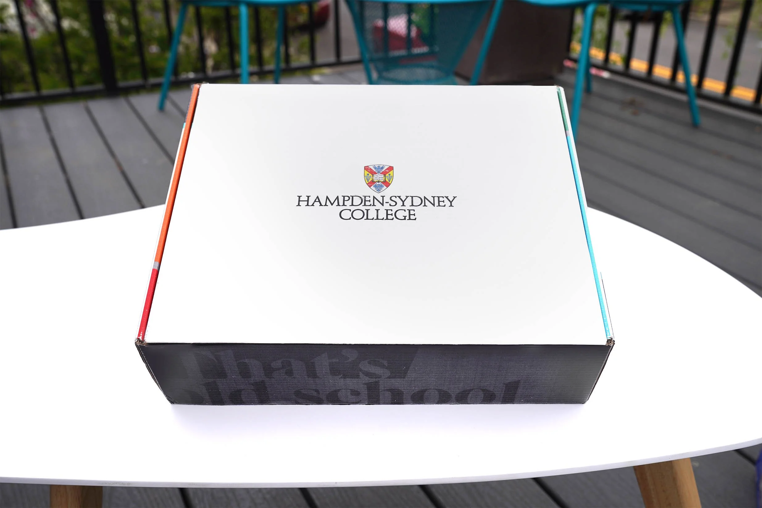
Freshman Welcome Kit

Freshman Welcome Kit

Client: Spice Hunter
Agency: Familiar Creatures
Role: Art Direction + Design
Spice Hunter’s mission is to create authentic spice blends that the average American might never have tried.
We were tasked with a logo and packaging refresh. We had to keep the hexagon shape from the previous logo, but modernize it. For the packaging explorations below, we were tasked with making the product look more luxurious, for a younger female audience. Client ended up pausing the project until next fiscal quarter.


